During the process of making the front cover for my music publication, I had a variety of ideas in which to portray the genre's of music that I was mostly focusing on. First of all I had my flat plan of the basic conventions of the magazine that I wanted to fulfil. So to start off I created an A4 sized canvas on photoshop and placed my Masthead on the page in the top left to give it its very own place on the publication, not mixed in with anything else. However I felt that the masthead deserved a slant to typify the Genre it is depicting.
 Secondly the features I had previously planned I integrated into the publication. These followed in the colour scheme I had chosen of predominately red furthermore with the font selection, showing an urban but yet composed style. Although to complement the title of the features I felt that orange on the lure's underneath would really sell the features.
This was followed by choosing a strapline which I felt could just top it all. I believe I have done that with my 'R'n'B with a serving of grhyme'

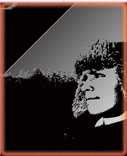
Perhaps the biggest most forefront problem I had in really setting the bench mark for this front cover is that I wanted to have one whole image to really sell the magazine in terms of aspirations, emotions and genre to dominate the background as well as the front cover itself. I had selected an image which had a very autumn feel to it and although I believed it could fit into the magazine without any altercations. The colours didnt seem quite right. So I filtered the image using the Photoshop filter engine and selected 'Plaster' Which can be seen fig.4 of this post. However the balance of the lighting and the smoothness were way to heavy, not giving the image its effectiveness and power. So I tinkered with the lighting, balance and smoothness then found the right setting which I wanted as you can see. The lighting of the face and the definition of the hat( a cultural significance) gave it a great personality. Also with the backdrop of the image to an almost frosty treeline, although the tree's can not be seen from the normal image.
 Furthermore i added the line for where the masthead would
 be placed.The colour scheme of the image I wanted to be a solid black and white/grey to really give the image a cold but yet powerful story. The effects I used around the image and also upon it are shown as i used the Inner Glow and the Stroke to create the almost peppered red outline, along with the gradient overlay to give the background of the image the grey feel.


 Secondly the features I had previously planned I integrated into the publication. These followed in the colour scheme I had chosen of predominately red furthermore with the font selection, showing an urban but yet composed style. Although to complement the title of the features I felt that orange on the lure's underneath would really sell the features.
 be placed.The colour scheme of the image I wanted to be a solid black and white/grey to really give the image a cold but yet powerful story. The effects I used around the image and also upon it are shown as i used the Inner Glow and the Stroke to create the almost peppered red outline, along with the gradient overlay to give the background of the image the grey feel.
