
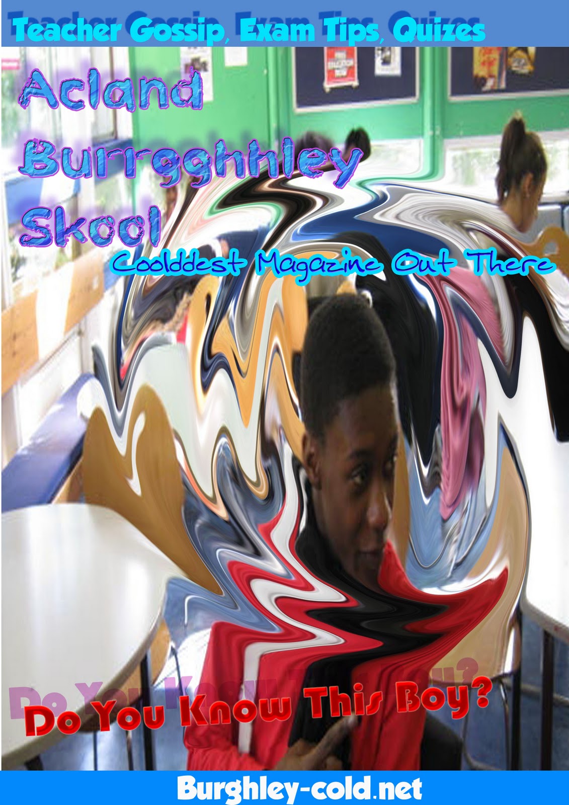
The winter feeling that I wanted to install into the magazine is shown through the colour scheme I chose to use, of a blue and very cold icy feeling with purple and pink also integrated. The Masthead I decided to use, also links to the youth of the school with 'Skool' as this points out to exactly who the target audience is. Also this coincides with the prolonged 'uurgghh' sound to relate to the shivering that winter brings. The colour and font used on the Masthead is where you can instantly begin to create the cold theme as the font, which was downloaded off Dafont is very frosty like. This is followed by the blue and purple mix to create a very frozen and isolated looking text. The masthead was created by using a drop shadow, Outer glow, Satin and bevel.
Secondly, the strapline 'The Coolllddestt Magazine out there' again reflects the cold theme with the pun of 'coldest'. Also the colour of a blue interim and baby blue rim, creates the mood that is often reflected from winter. The image of the boy used, is pictured wearing a scarf to again extract the cold from the period of which the image was taken, thus fully installing the theme amongst the target audience. However the unfamiliar mirage that is created around the head of the boy, is to give a sense of pressure, which comes with A-levels and the magazine helps to sort these headaches out by giving exam tips. Lastly the red rhetorical question used to point out the boy also imitates the feeling of anxiety and stress during study periods, in which everybody duly feels.
The use of different fonts also shows a vibrant diversity throughout the school in which is sure to be shown in the magazine, and although the colours are mainly associated to males, in which the school is male dominated with a 3:1 ratio, the magazine is still viable and accessible by both genders. Also the features such as teacher gossip, exam tips and quizzes are all something that the average college student want to know but don't normally have a regular way to express or gain access to this.

No comments:
Post a Comment